
Google Play: Monetization & Apps
The Google Play team needed help simplifying interactions within their subscriptions and notification center to increase user engagement and overall user growth initiatives.
Below are some project examples.
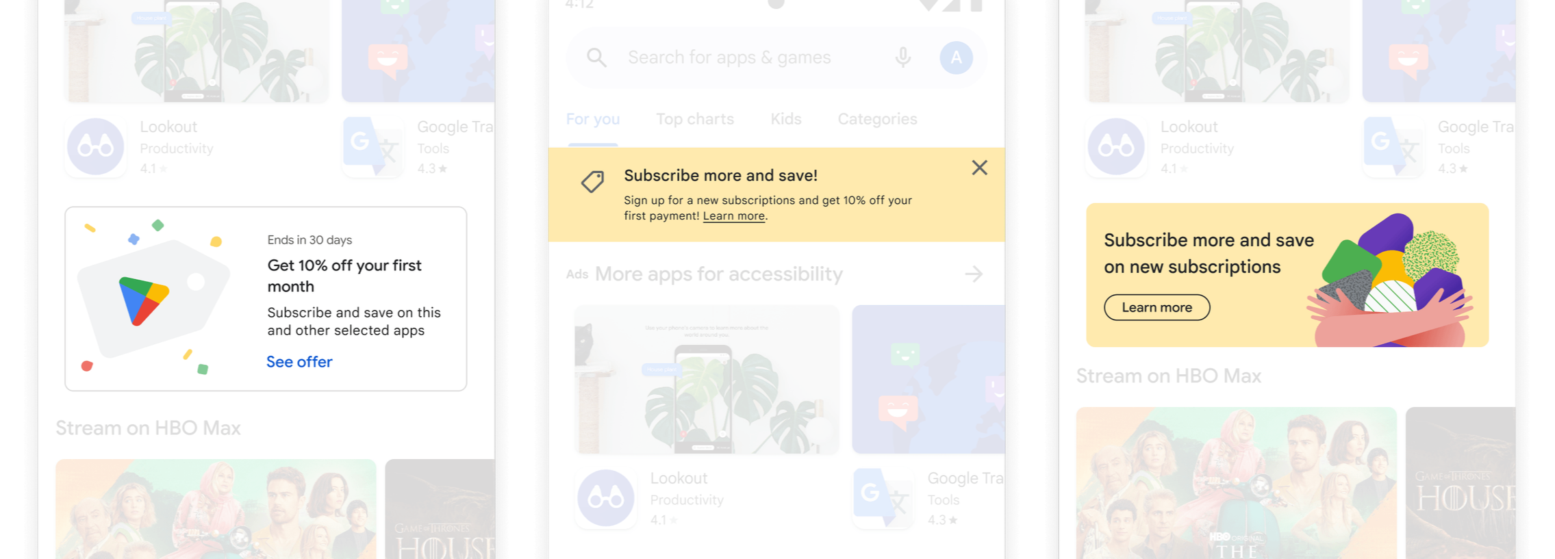
Subscribe More, Save More
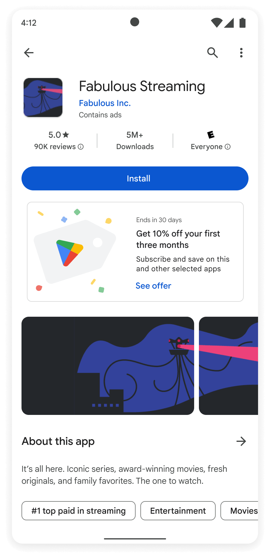
SMSM is aimed at surfacing offers to Google Play users who have existing subscriptions on the Play Store and to incentivize them to add new services by offering a 10% discount on featured subscriptions.
We conducted usability testing and these were our key findings.
Concerns
All participants felt the 10% discount would only be enticing if they were already planning to start that subscription.
They felt one month was not enough to influence them.
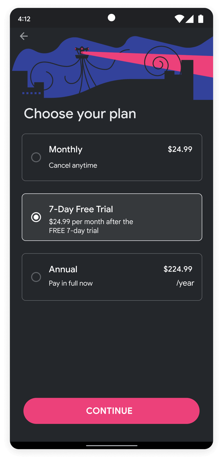
Most preferred having a free trial offer instead as there was less of a commitment and a more honest way to test the subscription.
Solutions
We extended the time of the offer on all selected promos from one month to three.
In the checkout process, we added a 7-day free trial to provide subscription options.
Offer Detail Page
Concerns
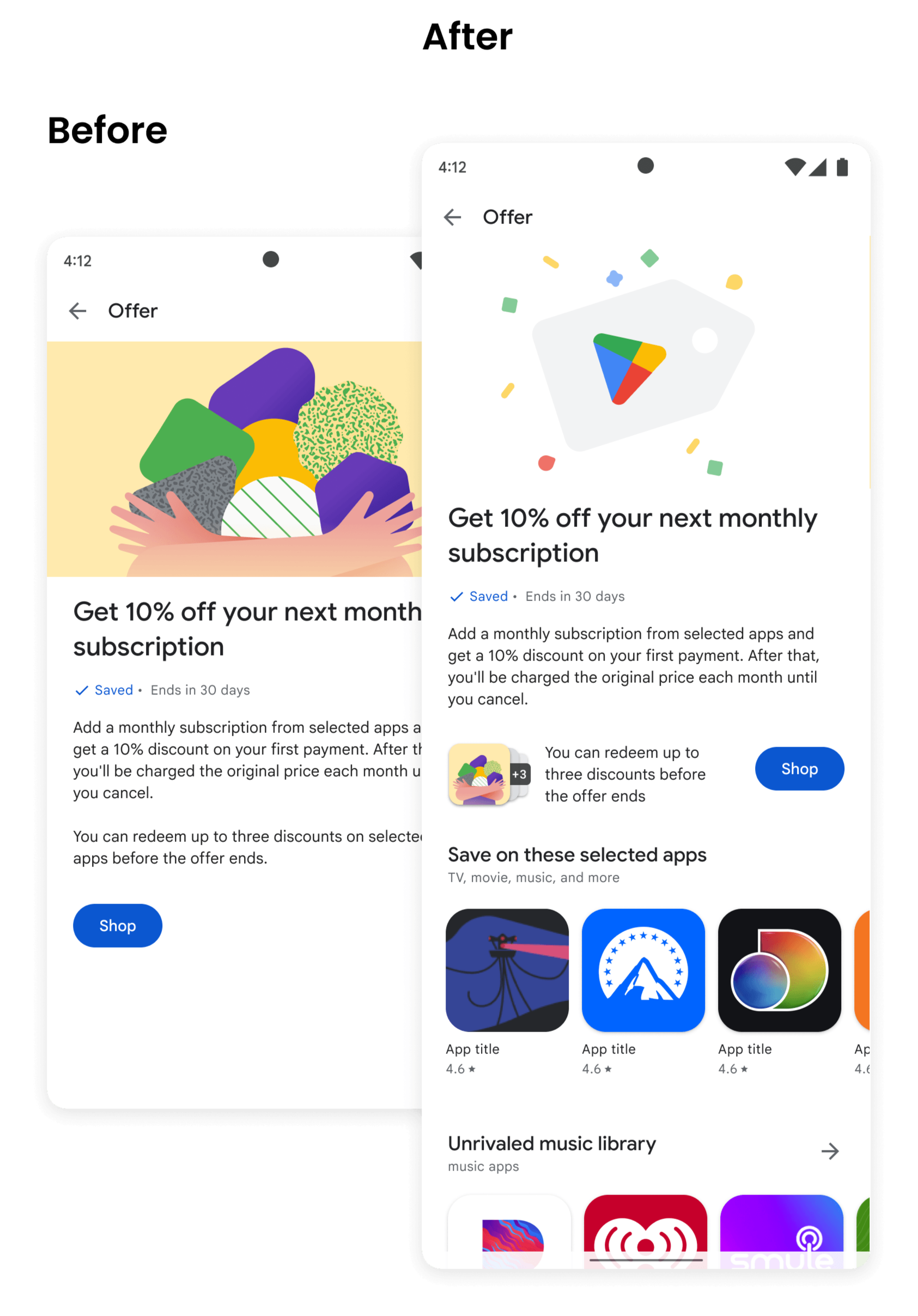
Most participants wanted to see a list of categories that the offer could be used for on the offer details page.
They also wanted a way to shop for those categories while still on the offer details page.
Some mentioned they did not notice they could use this offer on up to three subscriptions and were hoping that info could stand out more.
Solutions
We added carousels of subscription genres the offer is eligible for in the offer details page.
We made sure a “shop” CTA is always on the page so they can access the offer without leaving.
Made the “up to three” statement more visibly pleasing and pronounced to avoid being overlooked.
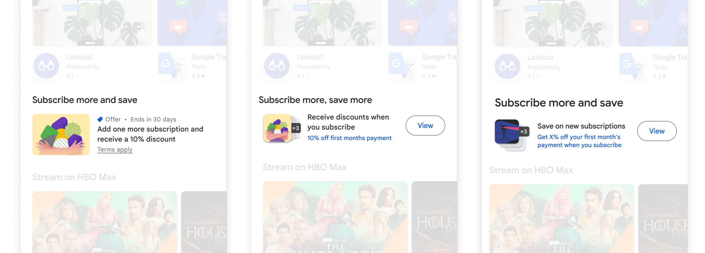
Examples of design explorations for the offer modules on the homepage.
The Results
Overall, these findings and solves lead to happier players, less confusion, and a higher user engagement for the SMSM effort.
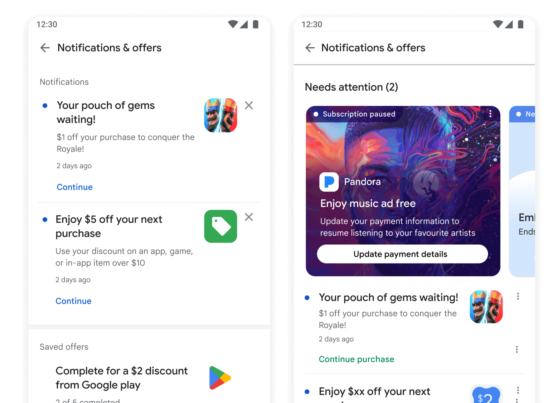
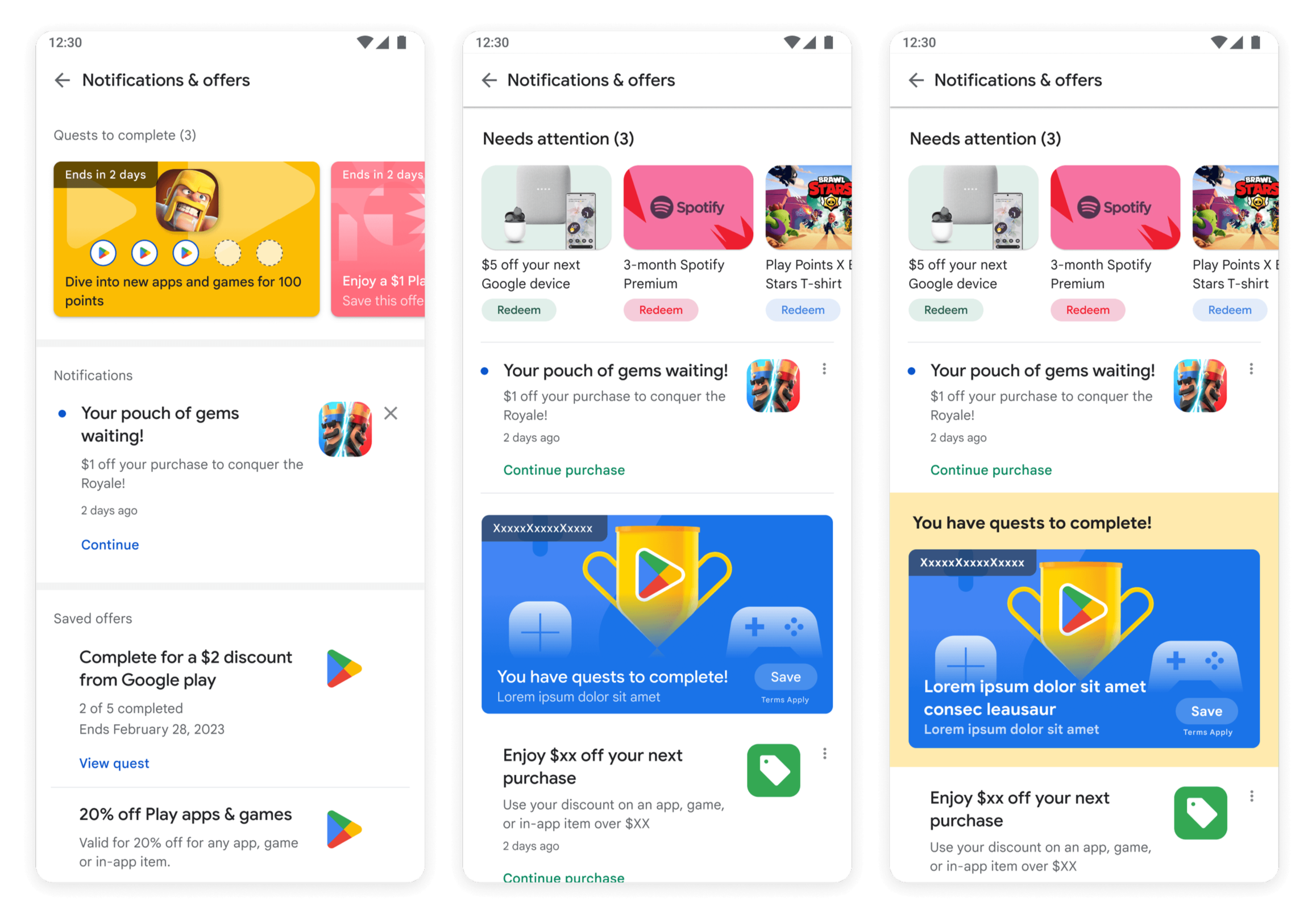
Notifications center
Google Play needed a smarter notification center that surfaced offers, high-priority items, and pending tasks without feeling out of place or taking up too much space.
Our challenge was to design compact experiences that felt native to their system while still commanding attention.
Main Concerns
The high-priority modules were too clunky, taking up too much vertical space with only the top for placement.
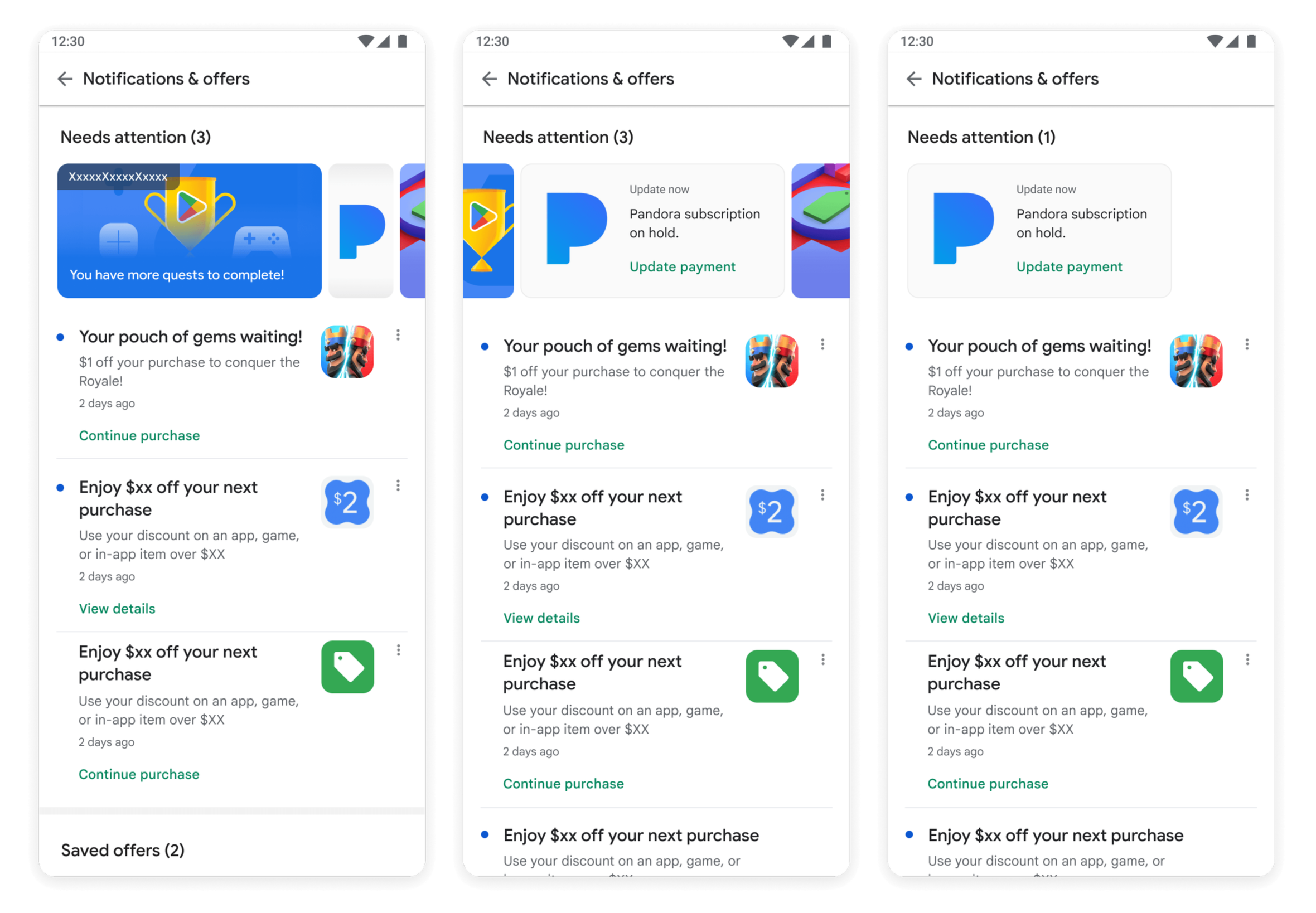
Solutions
A smaller, simple side scroll function able to hold multiple cards within the carousel.
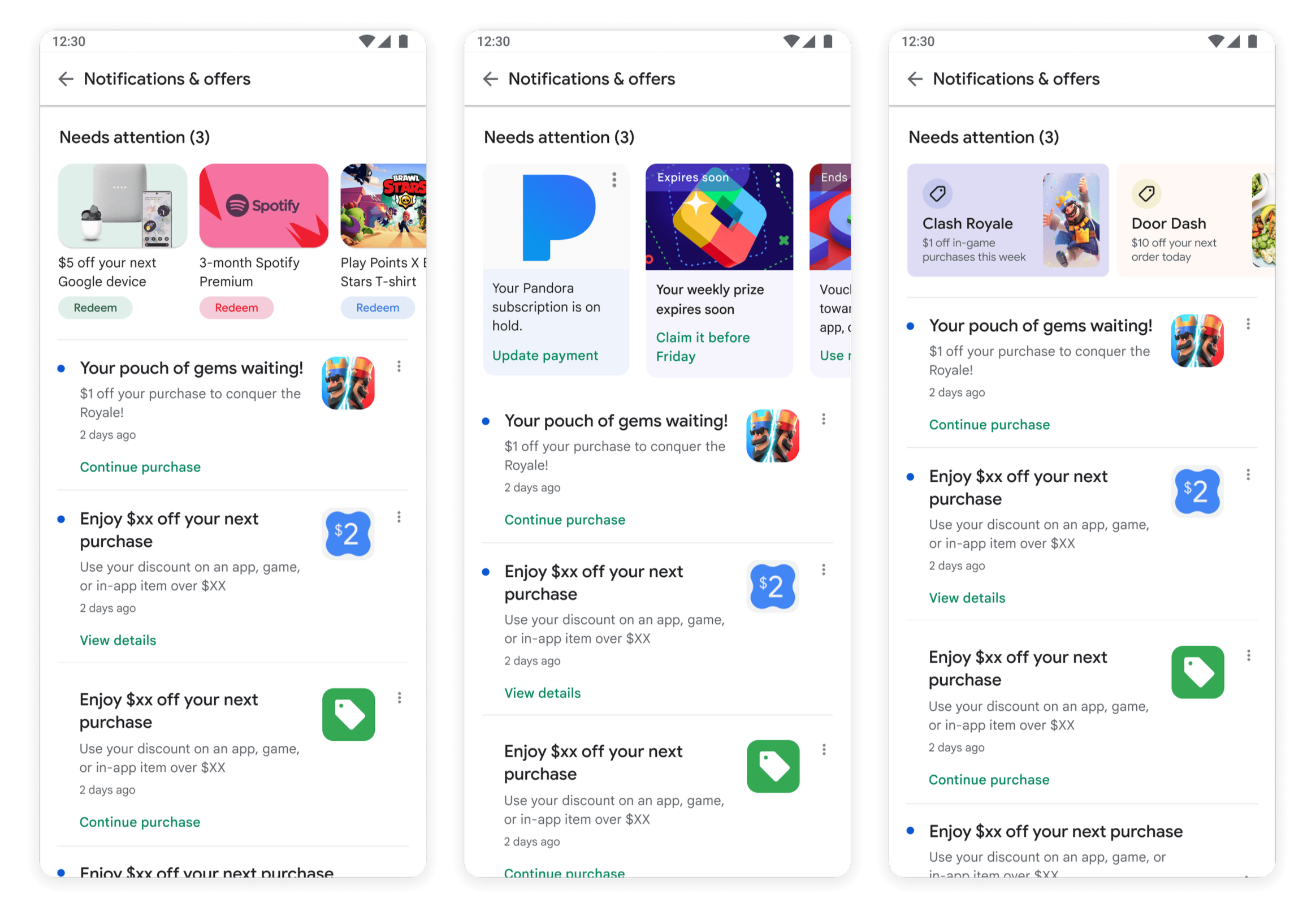
Variations of card carousels providing emphasis on different attributes of the promos and offers.
Specific promo placements for Quests and uncompleted tasks. When there are promos at the top, Quests can live farther down the page to prompt the user to explore and not experience fatigue.
The Outcome
Visually more pleasing and interactive functions that keep users engaged while still holding true to the native design system.