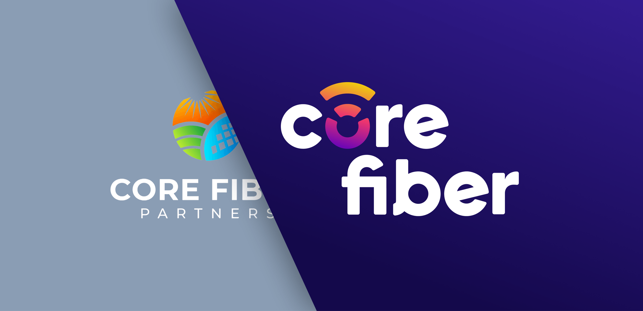
Core Fiber Rebrand
Core Fiber is a parent company uniting a network of local internet providers under one roof and built on the belief that reliable connectivity should feel personal, not corporate. With a vision centered on delivering dependable service, clear communication, and support that always feels close to home, Core Fiber needed a brand to match that ambition. The goal: create a modern, bright, and neighborly brand that felt as approachable as the local providers it represents.
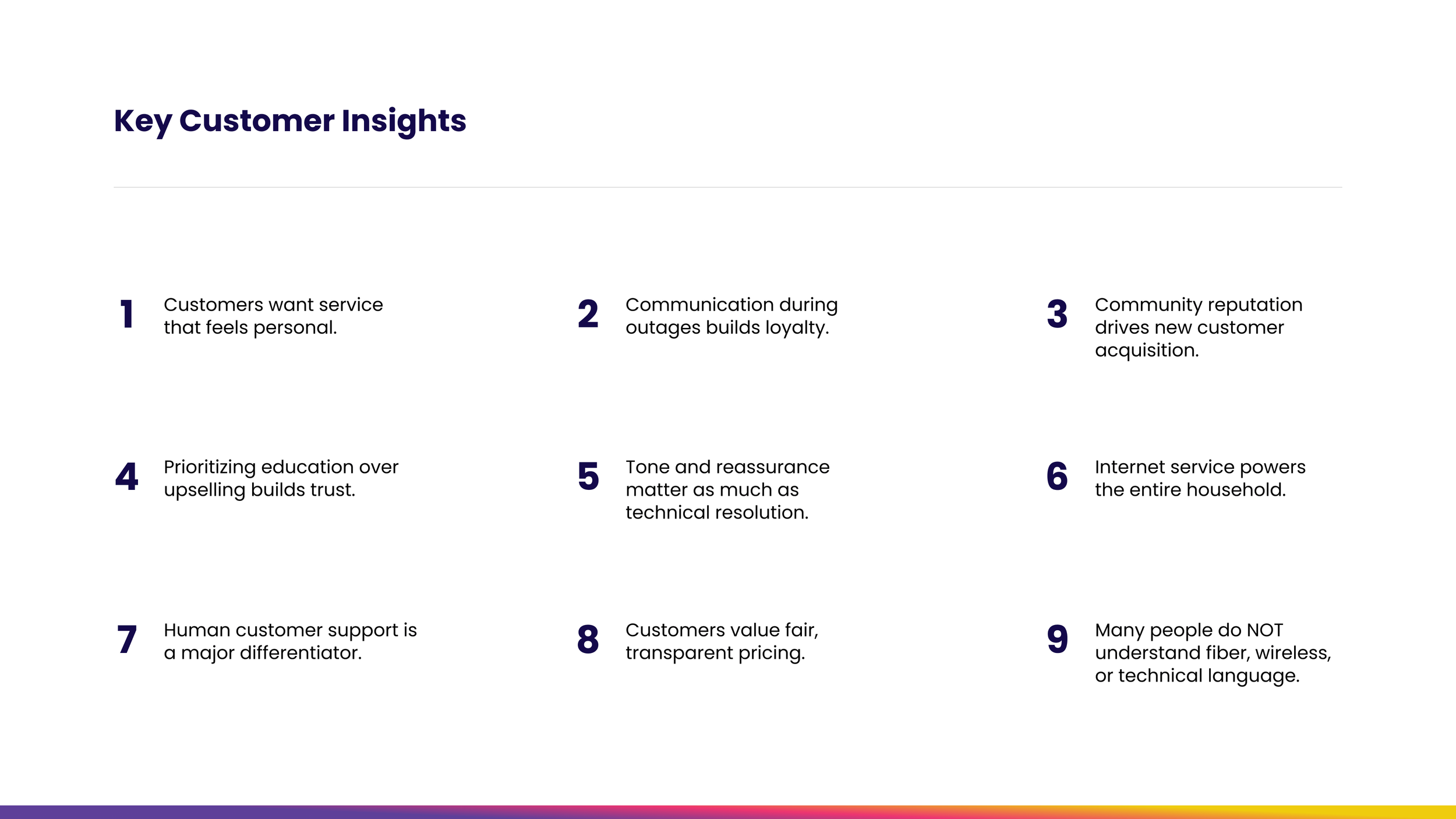
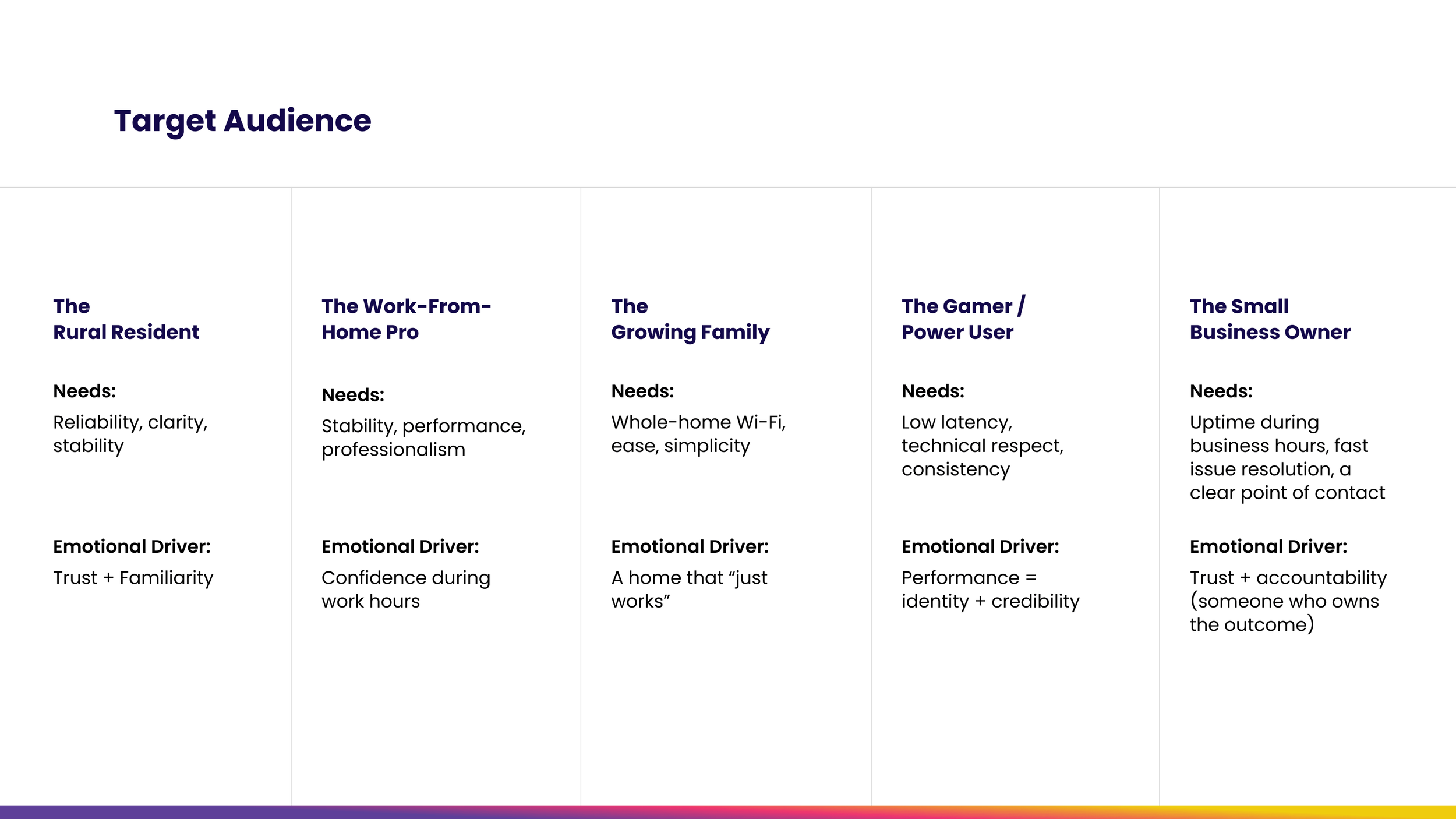
Listening Before Leading
We set out to answer the questions that matter most: What do customers actually want from their internet provider? What builds loyalty and what drives them away? What does "local" mean in a world dominated by faceless telecom giants? What emerged was something the big players couldn't replicate: genuine local roots and providers who know their communities by name. This research set the foundation for everything that followed.
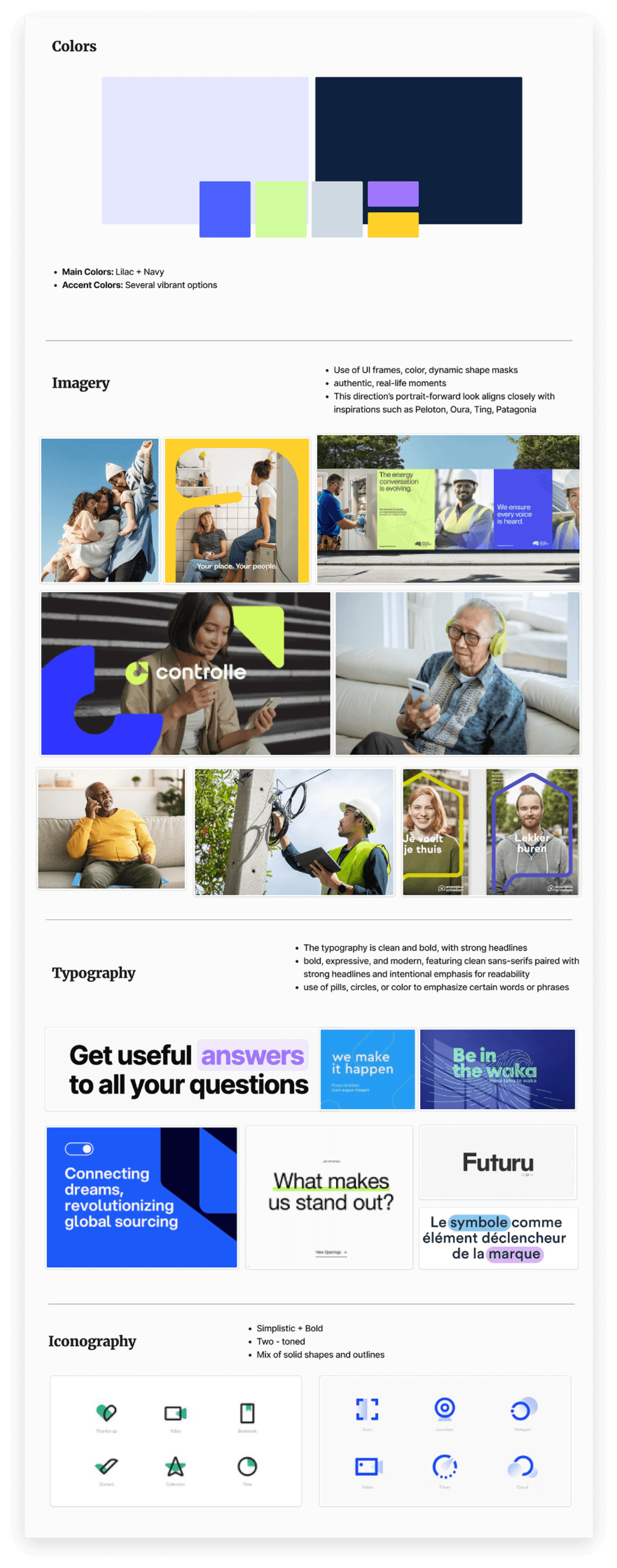
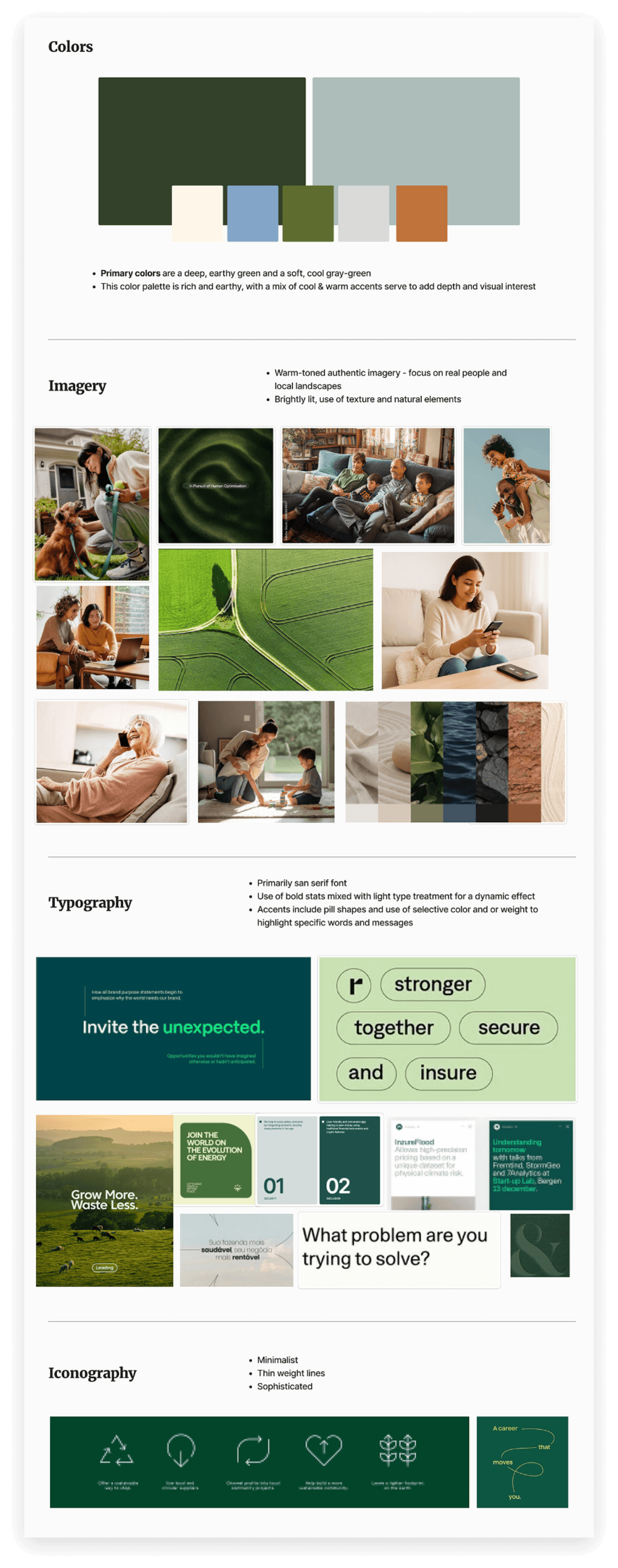
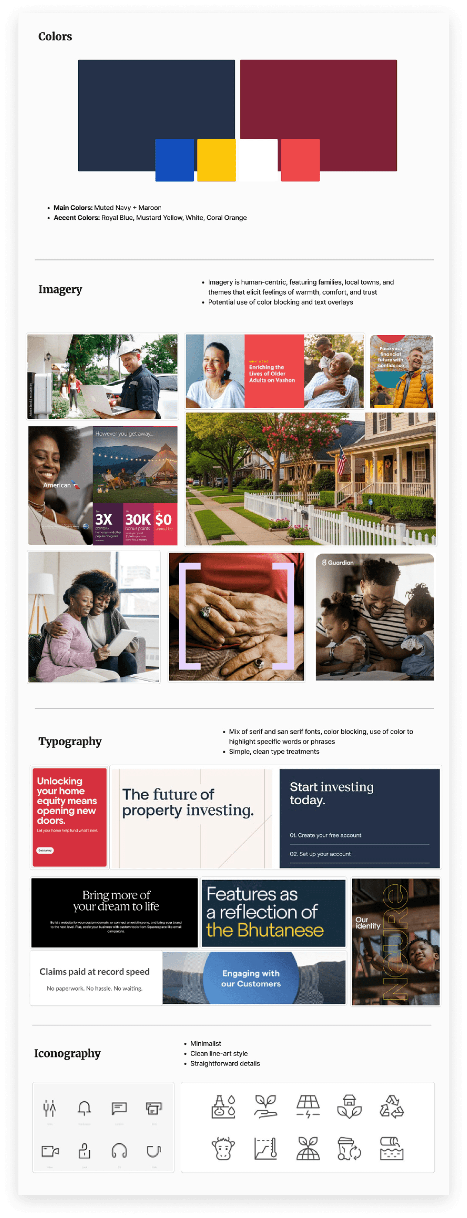
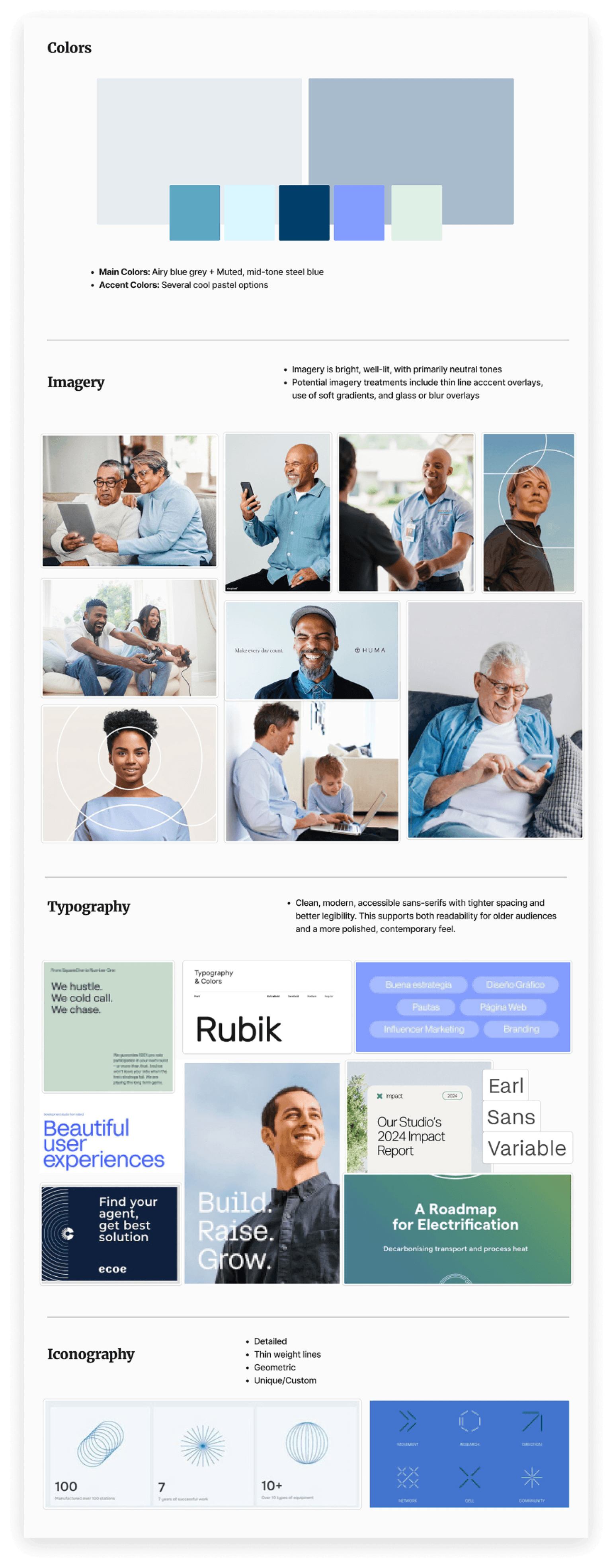
Visual Directions
We developed a series of mood boards, each thoughtfully curated with different audience segments in mind, exploring a range of color palettes, typography pairings, imagery styles, and unique graphic elements — giving the Core Fiber team a tangible way to react, respond, and align before any formal design work began. Once the team identified what resonated most, we distilled those favorites into a unified visual foundation and confidently moved into the design phase.
Bringing the Brand to Life
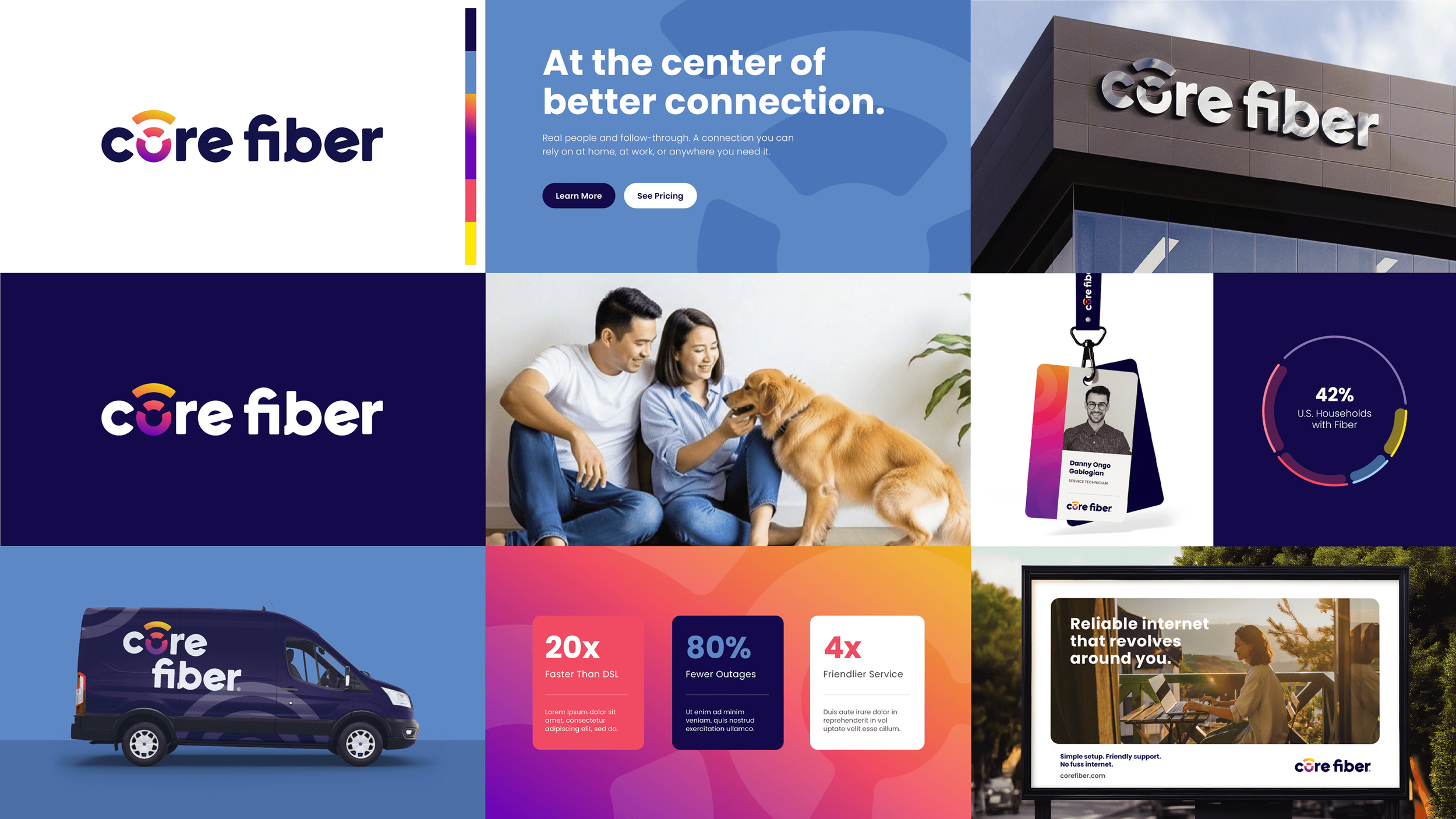
For the logo, we developed a custom type treatment for the wordmark that strikes the balance the brand demanded — modern and clean, yet warm and reliable. The trademark grew organically from the "O" in Core, where we crafted a mark using lines that reference wavelengths, broadband, connectivity, and energy — a subtle but meaningful nod to the communities it keeps connected. Nothing arbitrary, everything deliberate. The color palette was chosen with the same care, landing on tones that evoke friendly warmth while remaining bold and distinct enough to cut through the competitive landscape of corporate telecom. The result is a brand that doesn't just look the part but feels like Core Fiber.
The Full Brand World Into View
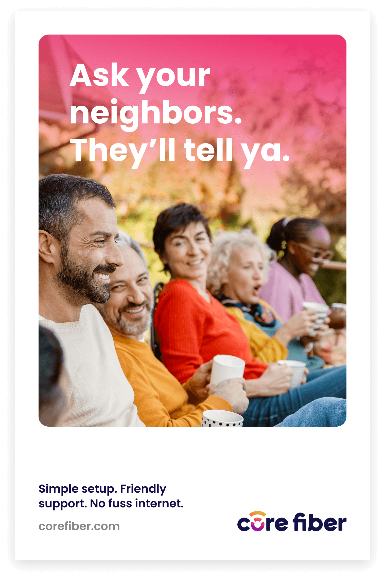
The style board expands the visual system with a wider color palette, complementary fonts, warm human-centric photography, and playful graphic elements pulled directly from the trademark to be used as accents. We also showed how the identity translates across real-world collateral, from company vehicles and employee badges to outdoor marketing pieces. Because a brand isn't just what lives on a screen, it's what people see in their day-to-day.
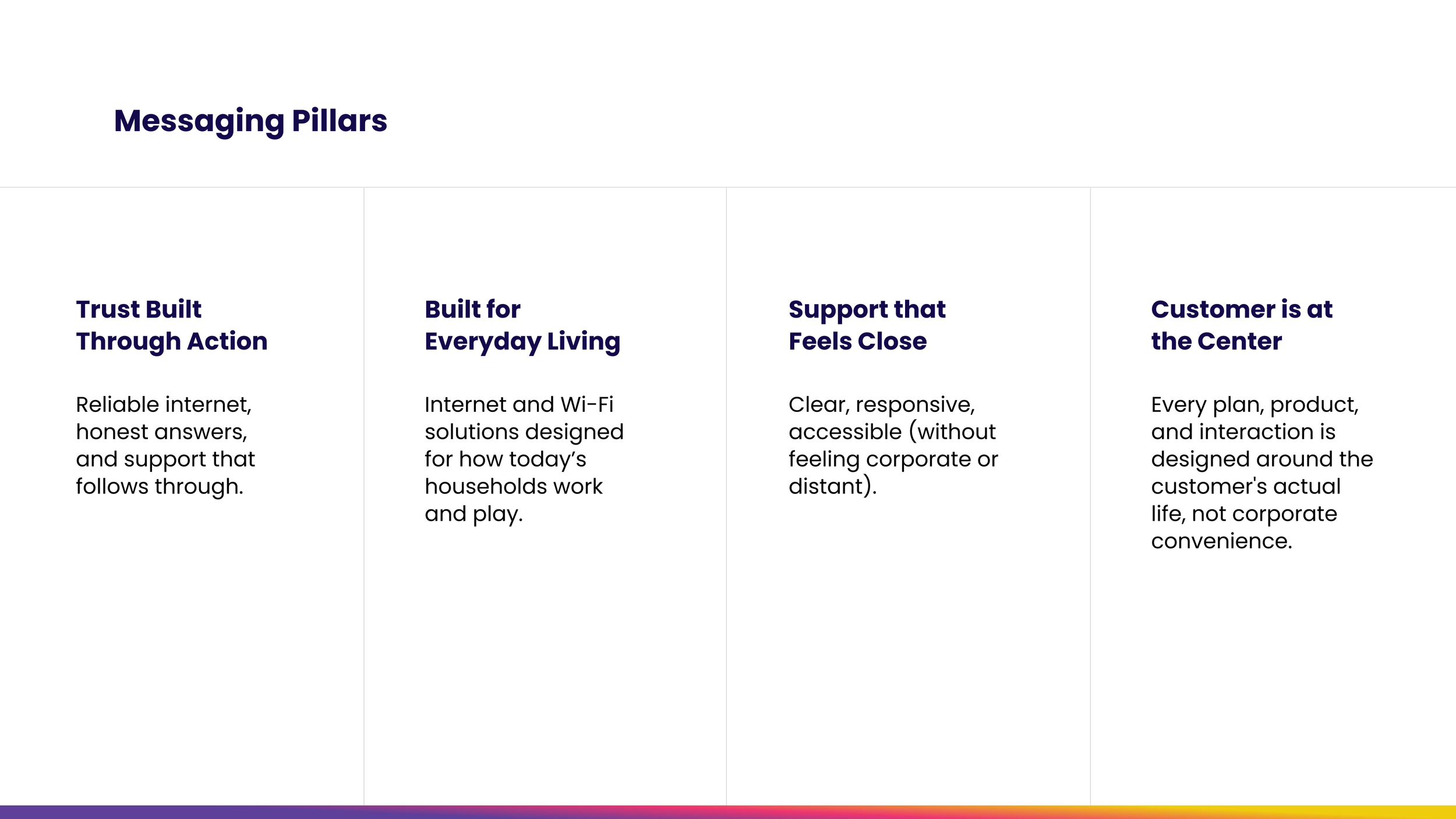
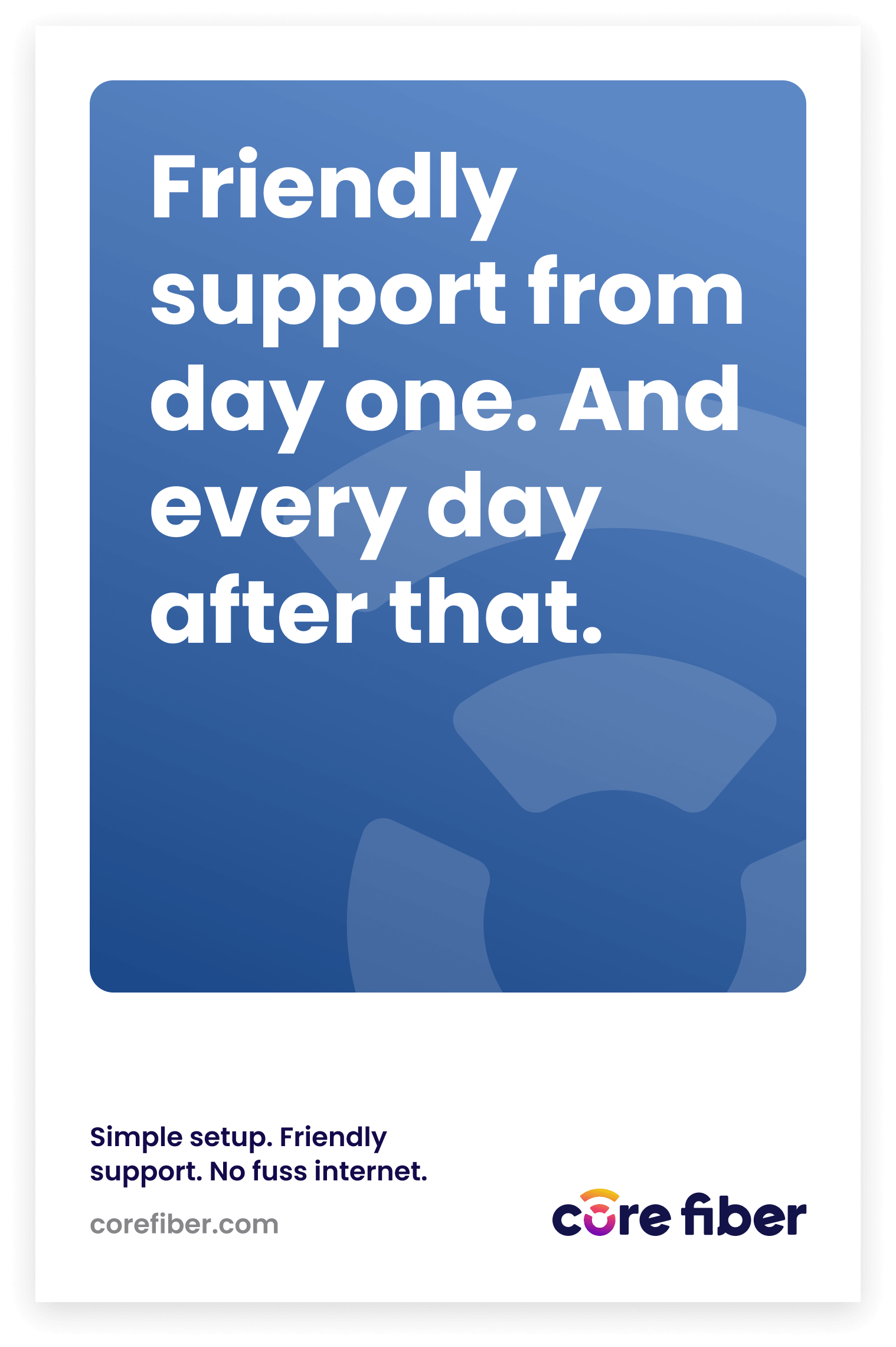
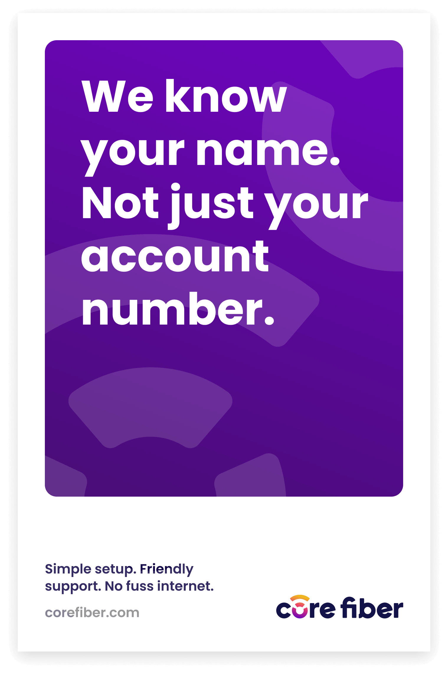
A Voice as Reliable as the Service
In an industry notorious for fine print and corporate-speak, Core Fiber needed to sound different — like a neighbor explaining something over the fence, not a telecom company burying info in a terms and conditions document. The messaging feels approachable, trustworthy, and consistent enough to reinforce the brand. No jargon, no filler, just honest plain-spoken communication that reminds customers Core Fiber is always close by.

A Brand Worth Connecting With
Core Fiber came to us as with a shared mission but no visuals or voice to carry it forward. What they leave with is a complete brand identity — a logo with meaning, a visual system built to flex, a voice that echos their communities, and messaging that cuts through the noise. Every decision was made in service of one goal: building a brand as reliable, warm, and connected as the experience Core Fiber delivers.